Back to library
cards
Card 12
Product card with hero image, like button, size/color badges, price, and CTA. Built on shadcn card primitives.
Inspired by Watermelon UI · View source
Preview
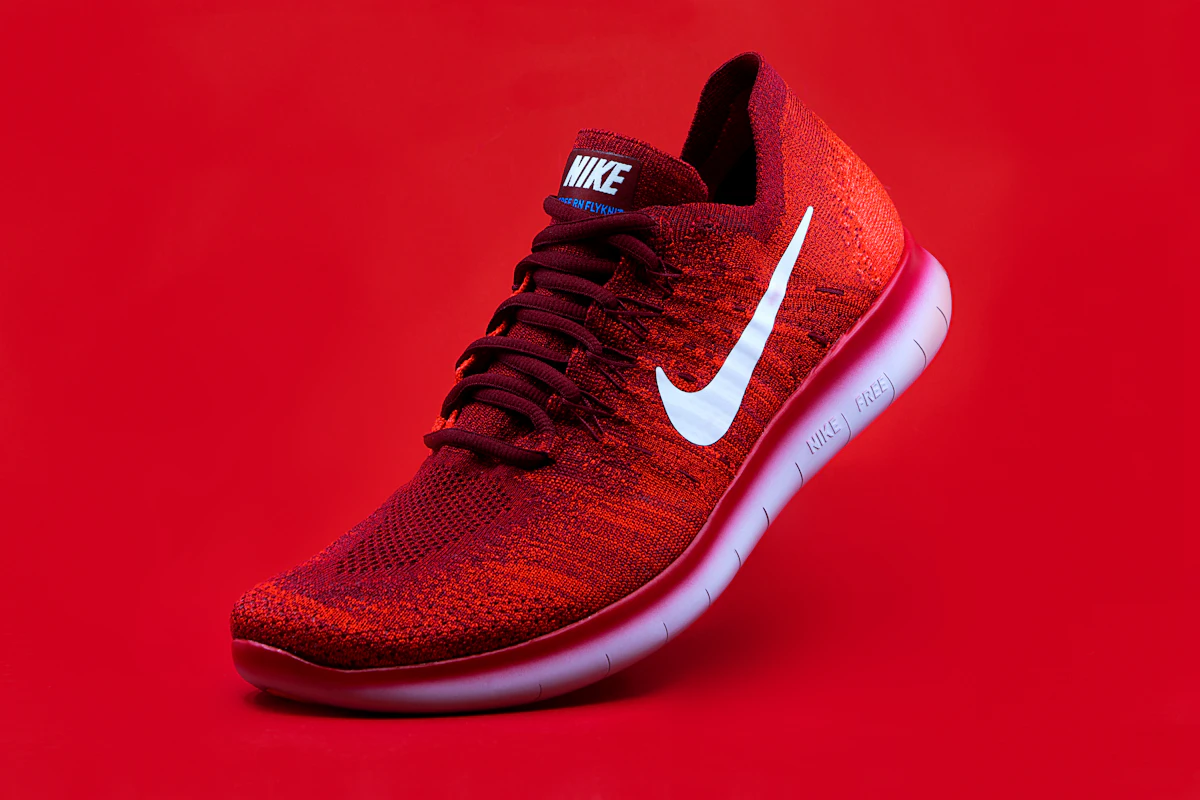
Velocity Run One
EU 39
Crimson / White
A lightweight everyday runner with a bold profile, cushioned sole, and a shape that works on and off the track.
Price$84.00
Copy for AI
Copy for Lovable is the fastest way to move this component into another Lovable project — it copies the full prompt with dependencies, files, and a usage example. Copy all files gives you the raw source if you want to paste it manually.
Installation
npx shadcn@latest add https://registry.watermelon.sh/r/card-12.jsonPaste into a terminal — or paste into a Lovable chat and I'll run it for you.
Source files
components/ui/card-12.tsx
'use client';

import { useState } from 'react';

import { HeartIcon } from 'lucide-react';

import { Badge } from '@/components/ui/badge';
import { Button } from '@/components/ui/button';
import {
  Card,
  CardContent,
  CardDescription,
  CardFooter,
  CardHeader,
  CardTitle,
} from '@/components/ui/card';

import { cn } from '@/lib/utils';

type ProductCard = {
  colorLabel: string;
  description: string;
  imageAlt: string;
  imageSrc: string;
  price: string;
  sizeLabel: string;
  title: string;
};

const product: ProductCard = {
  colorLabel: 'Crimson / White',
  description:
    'A lightweight everyday runner with a bold profile, cushioned sole, and a shape that works on and off the track.',
  imageAlt: 'Red running shoe on red background',
  imageSrc:
    'https://images.unsplash.com/photo-1542291026-7eec264c27ff?auto=format&fit=crop&w=1200&q=80',
  price: '$84.00',
  sizeLabel: 'EU 39',
  title: 'Velocity Run One',
};

const Card12 = () => {
  const [liked, setLiked] = useState<boolean>(false);

  return (
    <div className="relative max-w-md overflow-hidden rounded-2xl shadow-lg">
      <div className="relative h-72">
        <img
          src={product.imageSrc}
          alt={product.imageAlt}
          className="size-full object-cover"
        />
        <div className="absolute inset-0 bg-linear-to-t from-black/10 via-transparent to-transparent" />
      </div>
      <Button
        size="icon"
        onClick={() => setLiked((current) => !current)}
        className="absolute top-4 right-4 rounded-full border border-white/60 bg-white/85 text-slate-900 shadow-sm backdrop-blur-sm hover:bg-white dark:border-white/15 dark:bg-black/55 dark:text-slate-100 dark:hover:bg-black/70"
      >
        <HeartIcon
          className={cn(
            'size-4',
            liked ? 'fill-destructive stroke-destructive' : 'stroke-current',
          )}
        />
        <span className="sr-only">Like</span>
      </Button>
      <Card className="rounded-t-none border-none shadow-none">
        <CardHeader className="space-y-2">
          <CardTitle>{product.title}</CardTitle>
          <CardDescription className="flex flex-wrap items-center gap-2">
            <Badge
              variant="outline"
              className="border-border/70 bg-background/70 rounded-sm"
            >
              {product.sizeLabel}
            </Badge>
            <Badge
              variant="outline"
              className="border-border/70 bg-background/70 rounded-sm"
            >
              {product.colorLabel}
            </Badge>
          </CardDescription>
        </CardHeader>
        <CardContent>
          <p className="text-muted-foreground leading-6">
            {product.description}
          </p>
        </CardContent>
        <CardFooter className="justify-between gap-3 max-sm:flex-col max-sm:items-stretch">
          <div className="flex flex-col">
            <span className="text-muted-foreground text-sm font-medium uppercase">
              Price
            </span>
            <span className="text-2xl font-semibold">{product.price}</span>
          </div>
          <Button
            size="lg"
            className="bg-sky-600 text-white hover:bg-sky-700 dark:bg-sky-500 dark:hover:bg-sky-400"
          >
            Add to cart
          </Button>
        </CardFooter>
      </Card>
    </div>
  );
};

export default Card12;
Dependencies
lucide-reactmotion